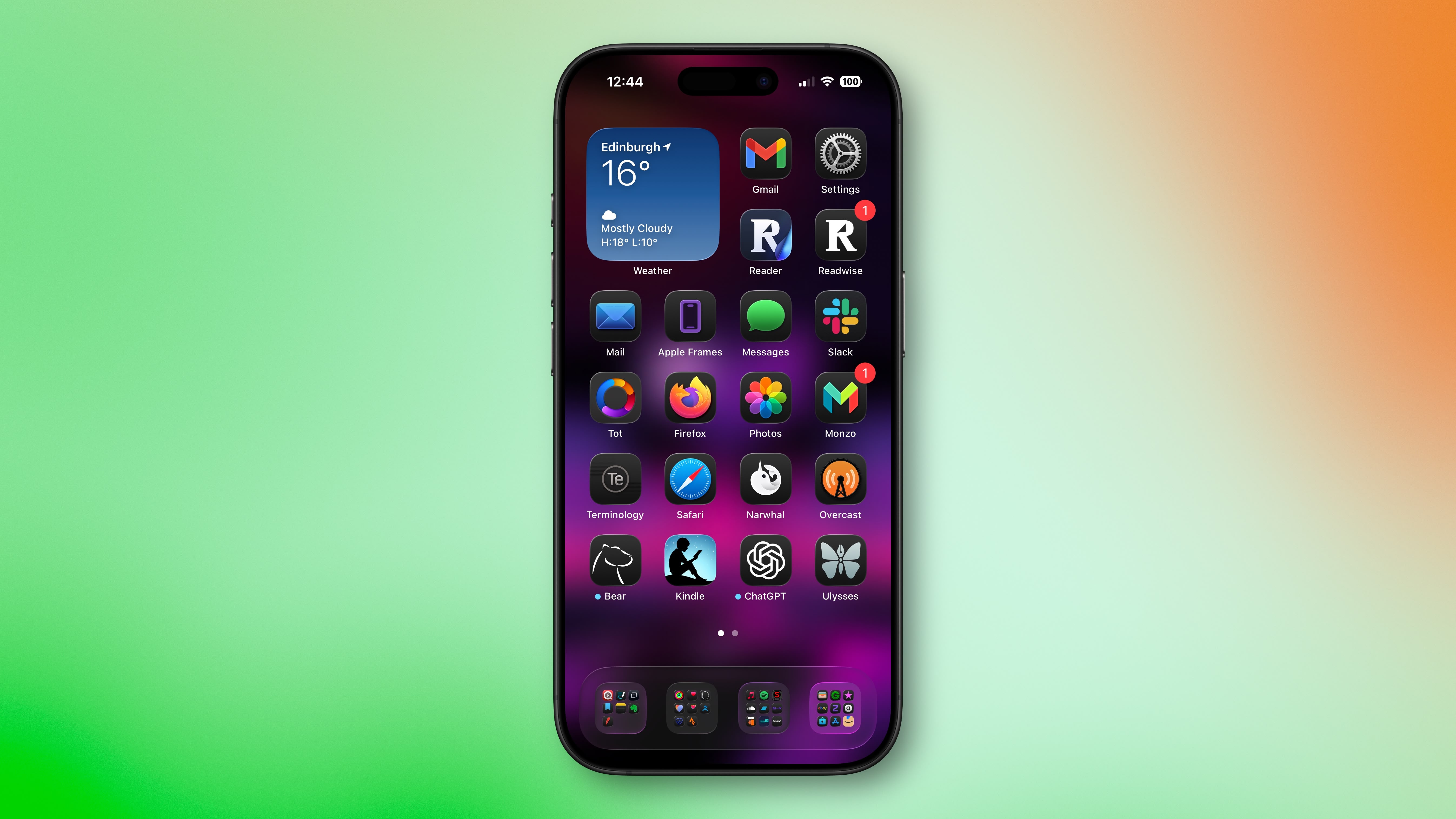
iOS 26 Liquid Glass Design Makes App Icons Look Crooked, Report Users
iOS 26’s new Liquid Glass interface has been criticized for making some content illegible in certain circumstances, and now the UI design is reportedly causing another unusual visual problem for some users.
Liquid Glass adds subtle glowing effects to app icons’ top-left and bottom-right corners, creating a glass-like appearance with depth and parallax effects. However, as noted by Gizmodo, this design choice can produce an optical illusion that makes icons appear tilted. Users impacted by the phenomenon report feeling disoriented, with some experiencing dizziness from the perceived slanting effect.
The issue has gained attention on Reddit, with one post receiving over 3,000 upvotes. “The frame glow effect makes apps look tilted, and it’s really distracting,” complained one user, while another said the update made them “feel drunk.”
“All of iOS 26 is an optical nightmare,” added another user. “It’s horrible.”
The tilting effect is most pronounced when icons are set to “Dark,” “Clear,” or “Tinted” modes against dark or black backgrounds, while colorful wallpapers seem to help mask the illusion by drawing attention away from the refractive corners.
Apple’s transparency reducing options and the “Reduce Motion” setting (Settings ➝ Accessibility ➝ Motion ➝ Reduce Motion) don’t seem to help minimise the illusion, with reports indicating most users fail to see a difference. Hopefully, Apple adds a dedicated control in a future update to adjust the icon effect that’s causing the issue.
Are you suffering from the Liquid Glass optical illusion? Let us know in the comments.This article, “iOS 26 Liquid Glass Design Makes App Icons Look Crooked, Report Users” first appeared on MacRumors.comDiscuss this article in our forumsMacRumors: Mac News and Rumors – Front PageRead More
